Post Purchase Evolution
Redesigning the post purchase experience to better match our customers mental modal when tracking deliveries and engaging with past purchases.
Lead UX Designer · Macy’s · Responsive Web · 2022
My role
I lead the end-to-design for PPE across three major releases (1.0 → 2.0 → 2.1), partnering with the lead product manager and engineer on scope, requirements, and feasibility, as well as working within Macy’s evolving design system as it was being released.
The problem
Macy's legacy post-purchase experience (PPE), where customers track packages, start returns, or review past orders, was a single, overloaded page. Every order a customer had placed sat collapsed under an accordion, with no way to search or filter beyond scrolling. If you didn't remember your order number or the date, finding the item you wanted to return or track meant tasking the user to remember the date they made the order or order number.
This was not only a frustrating UX problem but also one that was leading to excess support calls. The most egregious being “where is my order?”, “I cant find the product I’m looking for”, and “How to I start a return”. Untangling it meant rethinking not just the layout, but where in the site key actions like returns should live at all.
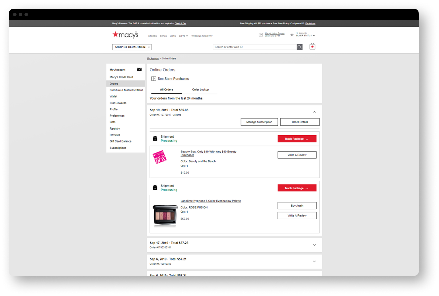
2.0: Moving away from order details
Going into the redesign, I believed two things were driving the confusion in 1.0. First, we were forcing customers to think in terms of orders, when what they actually wanted to do the majority of the time was to act on items or track packages. Second, the order-details page was being asked to do too much at once, serving as browse, track, and transact all in one place causing users to feel overwhelmed.
So the redesign made a structural change: split one overloaded page into three focused ones.
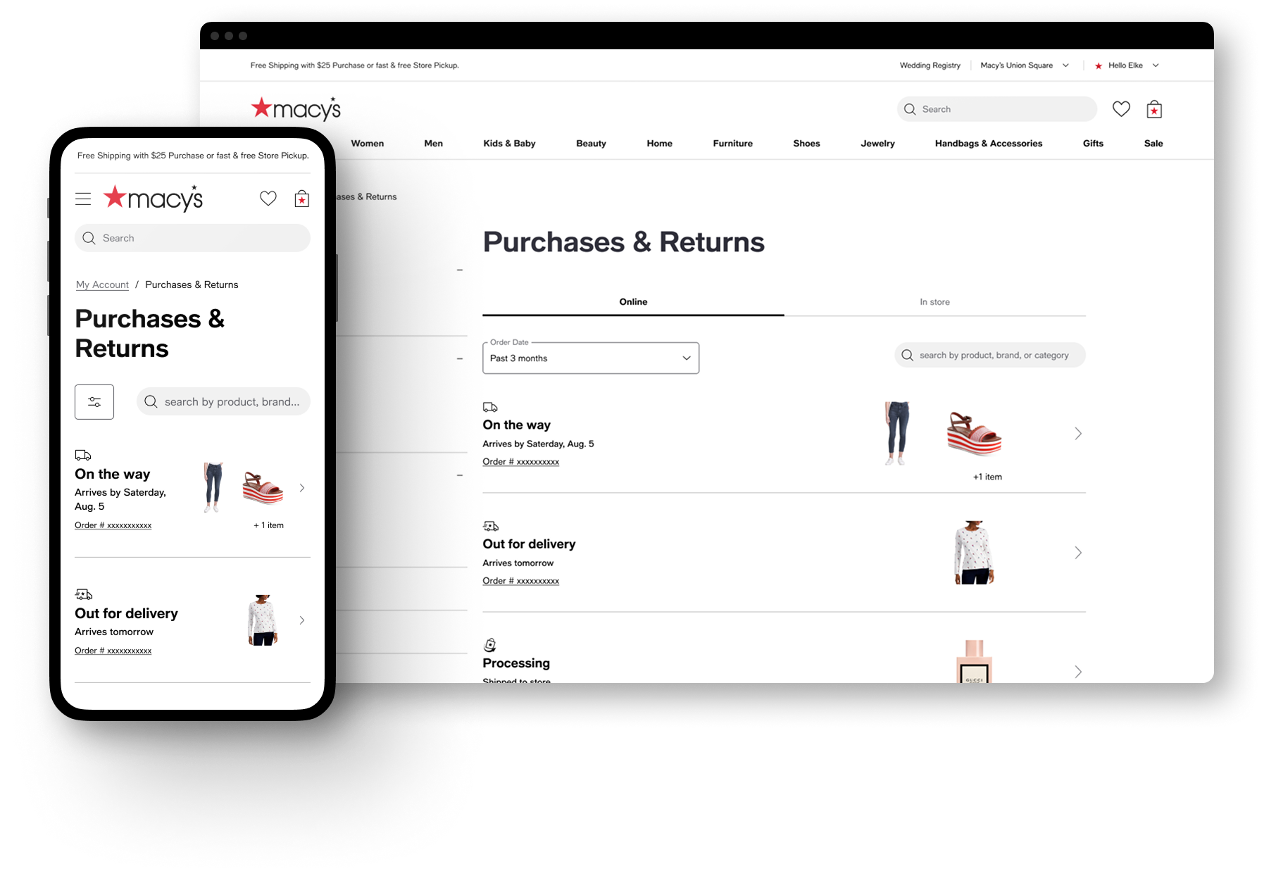
Purchases & Returns moved from an order-based list of accordions to cards that surfaced packages or items current state linking to the new tracking or item details pages respectively, and allowing customers to directly see what needed attention (incoming, in-progress returns) versus what was resolved, without digging through history.
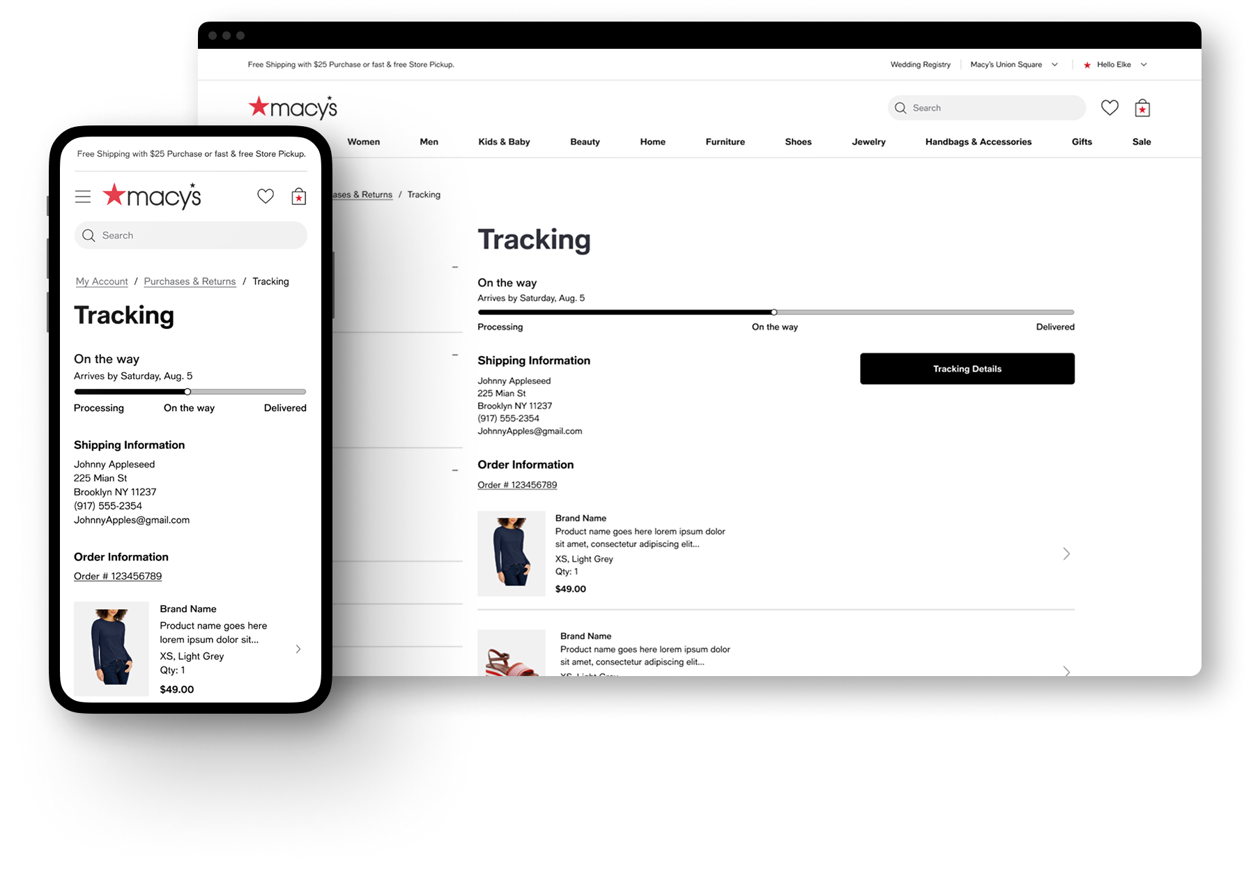
Tracking became its own page, providing a focused view of delivery progress and package contents, and enabling our "On the way" email link land somewhere useful instead of dumping customers into a dense order details page.
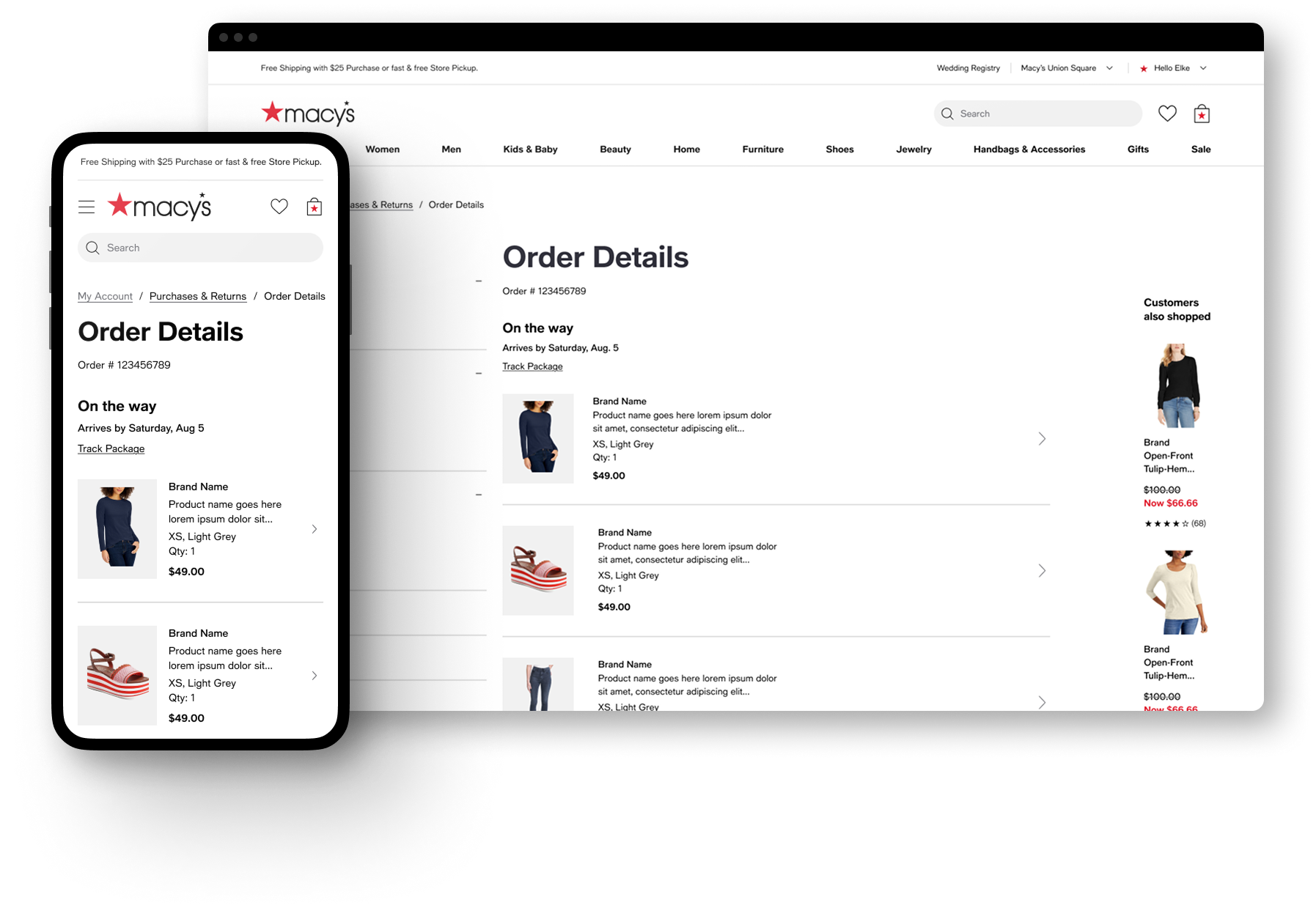
Order Details, in turn, was transformed into a place where the users could reference the true details of there order, transaction information, order contents, ect. rather than a primary place to do anything.
Item Details became the new entry point for returns, reviews, and buy-again. Along with surfacing individual items to the P&R page moving those actions to the item level allowed customers to think in a way that was more natural, “I want to return the shoes," not "order #12345.”
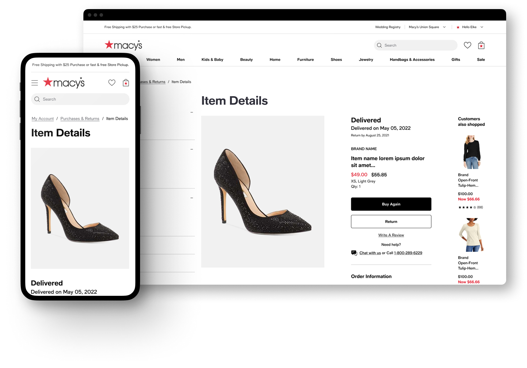
This wasn't just a visual refresh riding along with the site-wide 2.0 styling update, it was a restructuring of the information architecture, spreading out the experience across more dedicated pages and focusing more around items rather than orders. Cutting the path to starting a return or track a package by two clicks.
Testing the hypothesis
To spite receiving positive feedback from users in our user testing, we began to see two pain points surface in our customers feedback and analytics after release.
Many customers were not understanding the Item Details page and getting stuck in a loop, possibly confusing it with the PDP due to its similar layout, they would cycle between P&R to Item details, then navigate back to P&R again.
We had moved too far away from the concept of an “order” customers still desired to see their items contained within a group on the P&R page, especially for orders with multiple items.
2.1 The pivot
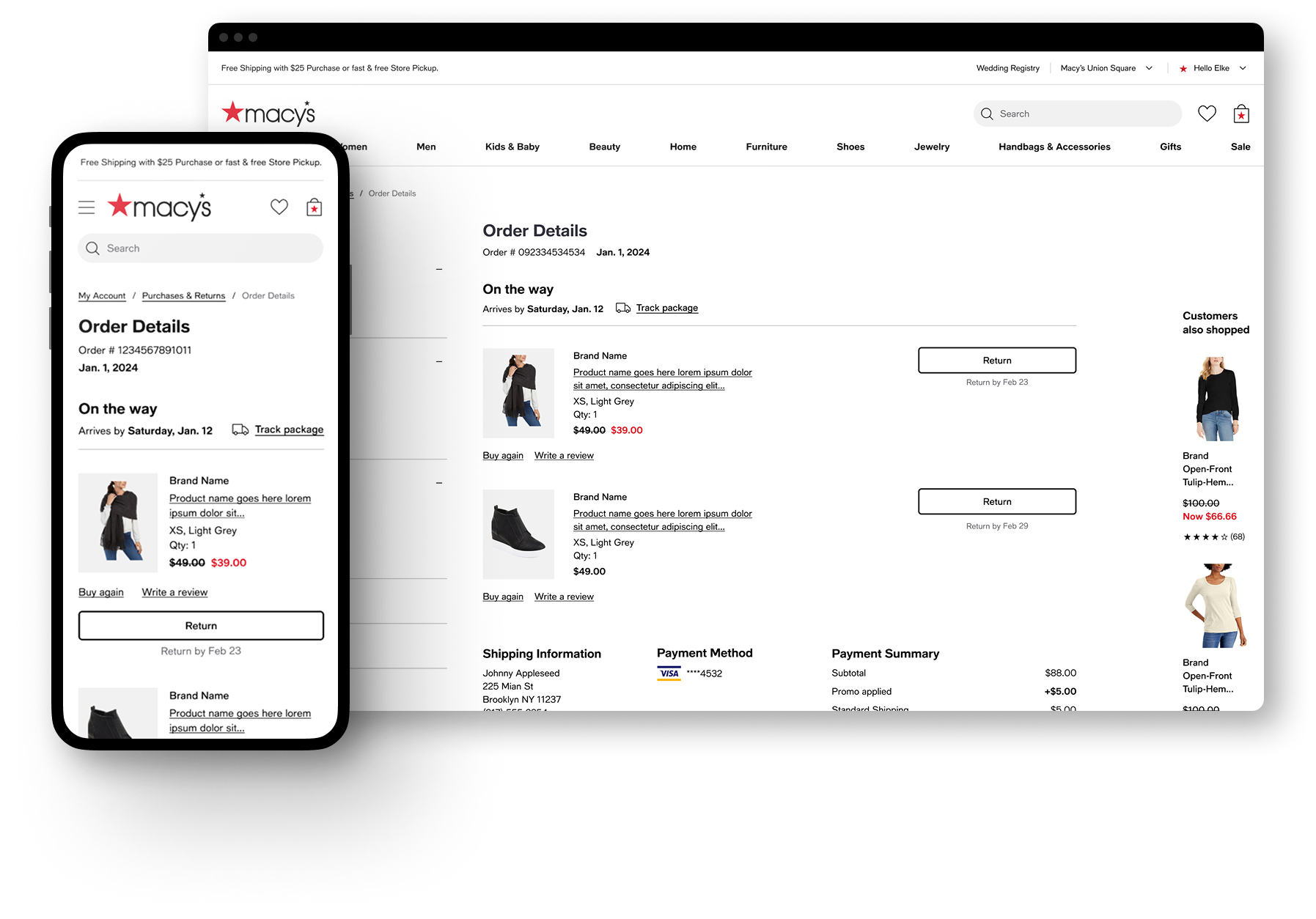
Rather than defend the 2.0 structure, I chose to retire the Item Details page and fold its interactions (return, buy again, write a review) back into Order Details and the Purchases & Returns cards, while maintaining the underlying item-level actions 2.0 had introduced.
The result kept what worked and cut what didn't:
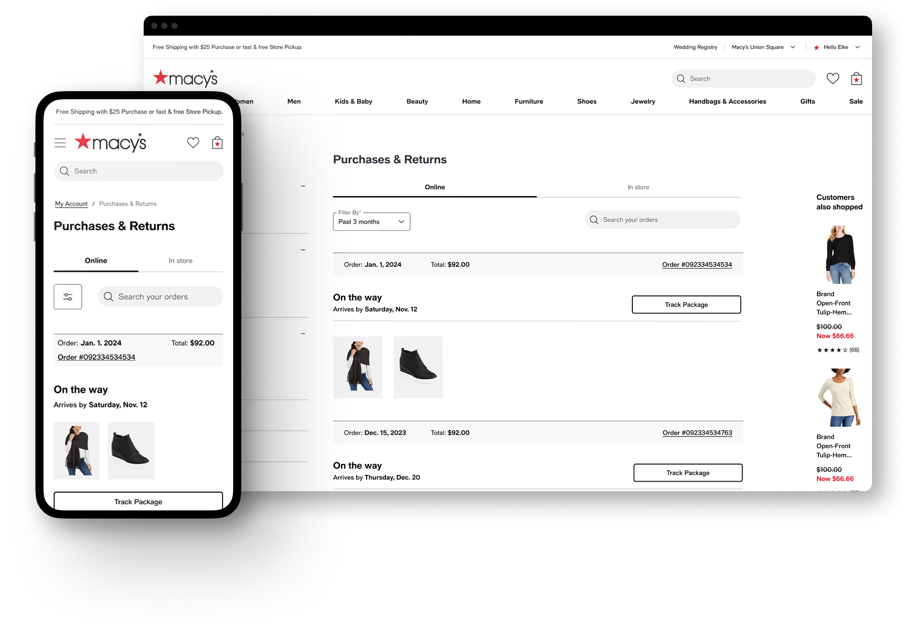
Purchases & Returns reverted to grouping shipments and items by order number, restoring the "view my order as a whole" orientation customers had asked for and adding as well as surfacing order date and price information sooner in the experience.
Order Details absorbed the item-level interactions directly, return, write a review, buy again all live there now, plus a new upfront Payment Method section
Tracking was left largely untouched, since nothing in the feedback pointed to it as a problem.

Outcome
Two-click reduction in the return-initiation path, sustained from 2.0 through 2.1.
[Directional or hard numbers if you have them: returns completion rate, contact-center ticket volume for "where's my order," task-success rate from any usability testing, adoption of the unified chat entry point, etc.]
Design-system and IA patterns from this work [carried forward to / informed] [other account pages, if true].
Reflection
The clearest lesson from 2.0 → 2.1 was that "customers think in items, not orders" and "customers want to browse by order" weren't actually in conflict — I'd initially treated them as an either/or IA decision when they were really two different moments in the same task: browsing stays order-centric, but acting is item-centric. Knowing that going in, I'd validate the navigation model separately from the action model before shipping, rather than bundling both into one structural bet and finding out which half was wrong after a year in market.
[Optional second sentence: anything about how this changed the way you now approach IA decisions on later projects — ties this case study into your broader design philosophy for the reviewer.]