Platform
Kiosk
problem
Redesign existing point of service kiosk in a fast food chain, then use this as a base for creating point of service kiosk UX templates, the client would use to offer a range of service experiences to their customers.
Solution
Conduct research and analysis to direct the revamped design of the current POS kiosk, improving its usability and updating the look and feel to be more inline with current trends. Then create variations on this initial design into flexible templates.
Role
Lead UX Designer of a small team, responsible for heading all user experience design activities, producing all UX deliverables, translating research findings into a design strategy, and organizing design sessions and presentations with the client.
FIndings
We utilized existing documentation from the client, in store observations, competitive analysis, and performed a heuristic analysis on the existing POS kiosk during our discovery phase. We found that the market of POS kiosks at quick service restaurants to be growing significantly, with 31% of customers opting to use the kiosk to order over in person, with this group expected to grow to 50% in the coming year. Kiosk experiences allow the customer to feel more “free” in their order, allowing for much easier customization to the order, with well designed “fun” interfaces and interactions leading to higher kiosk usage.
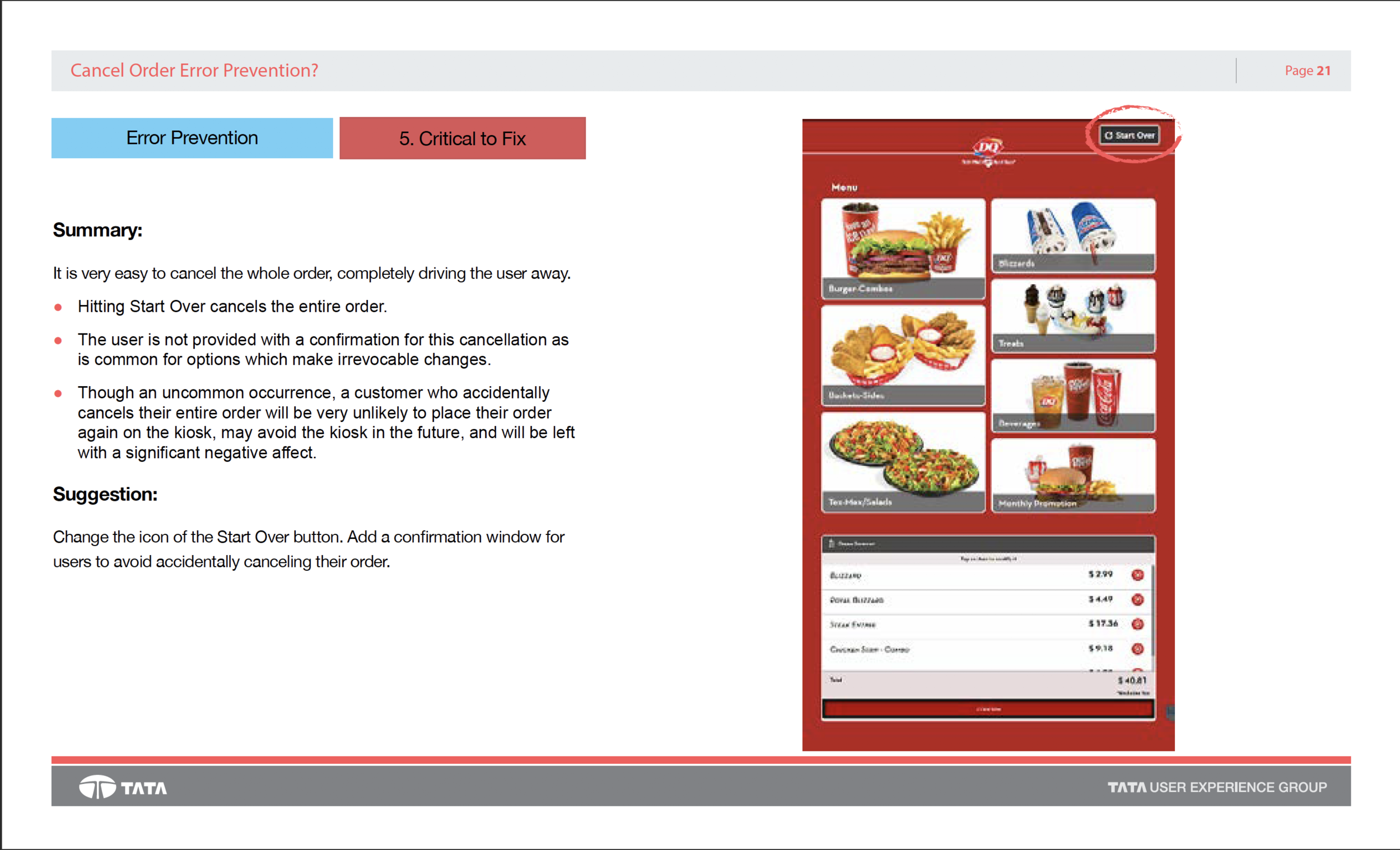
From the heuristic we found the current kiosk experience to be lacking in modern visual design and interactions, along with having critical usability issues when it comes to error prevention and task tracking. Leading to scenarios where the user is not aware of what items had been added to their order as well as being able to completely clear their order with one touch without intervention.


execution
Concepting
From our findings we began to chunk and restructure the experience using a touch point analysis technique. Which starts form a users desire, then breaks down this desire into drivers for the behavior, required supporting information, then finally interaction requirements to support it all. we then utilized this to structure our information architecture.
Moving into mock ups, ADA was a large focus, keeping interactions focused in the center or bottom of the screen. We explored several concepts for menu and product pages, as visual design was of high priority we left left ample space for large hero images and kept a clean simple layout in mind while concepting.


POS Kiosk REdesign
Moving into high fidelity we lead with emphasis on clean modern design more inline with the fun style used in their web presence and advertising. We also brought in assets from their marketing and created engaging moments with the user by adding interactive product images and other micro animations, resulting in an experience that felt much more polished than its passed design. Other UX best practices were also added to better direct the user through out the experience and better handle errors/mistakes in the users flow.


CLick through the Experience below
POS design concept templates
Creating two proof of concept alternatives to our initial design work. we produced a “sandwich shop” which experience was largely the same as the burger shops but implementing different visual style. Along with a “PIzza Kiosk” which explored a “built from the ground up” experience when it comes to menu ordering.


